When it comes to handwriting, legibility is a big issue. Students can work on letter formation, speed, copying skills, pencil pressure, and other components of handwriting…but there is one focus that can make all the difference in cursive legibility: letter size! Letter size is a huge area to address if you are concerned with cursive legibility and functional handwriting.
For printed handwriting, size is a big concern and a helpful area to address to boost handwriting legibility but the biggest way to immediately make a difference in legibility to to address spacing between words. When it comes to cursive writing, that key area is letter size.
This post is part of our 31 day series on teaching cursive. You’ll want to check out the How to Teach Cursive Writing page where you can find all of the posts in this series.
For more ways to address the underlying skills needed for handwriting, check out the handwriting drop-down tab at the top of this site.
For more ways to address the underlying skills needed for handwriting, check out the handwriting drop-down tab at the top of this site.
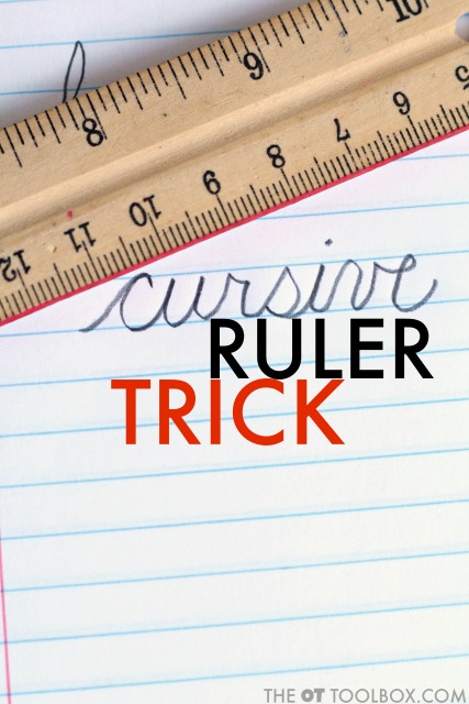
Cursive Legibility and Handwriting Letter Size
With cursive handwriting, the natural spacing that occurs with cursive letter connectors help to group words together. Addressing size will help with consistency of letter formation and overall look of cursive writing.
A smaller letter size is essential for increased speed that is needed for functional use of cursive as a writing form.
When some tall letters are hitting the top line and others are hitting at the midline, overall legibility suffers. When some small letters hit the top line, the letters can look like a different letter (A cursive e that is formed so it hits the top line will look like a cursive l).
Handwriting Letter Size Activity
Try this easy activity to address consistency of handwriting letter size and cursive legibility.
You’ll need just a couple of materials for this letter size activity:
Affiliate links are included.
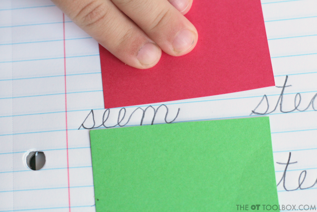
Cut each colored cardstock into small index card-sized pieces. Use these as starting and stopping guides for cursive handwriting.
The green cardstock can be the guide for a starting point for cursive letters. For some kids, knowing to start on the baseline is a big part of letter formation and cursive legibility.
For other kids, handwriting letter size is limited by the various sizes of cursive letters. For these kids, a visual guide of where to pause and re-trace or curve over to complete the cursive letter can really help with letter formation and cursive legibility.
Use the red cardstock to guide the top point of letters.
The visual guide can be used effectively when practicing a series of cursive letters such as a line of cursive letter b‘s. Simply hold the guide at the top line as a visual cue to stop at the top writing line.
The visual cue cards can be used as a visual self-check after writing a word.
Ruler Trick for Cursive Letter Size
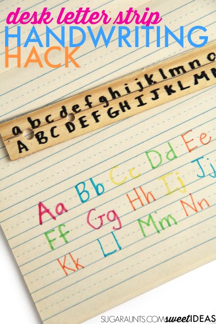
Another trick to help with consistent cursive letter size is to use the ruler trick. Use a wooden ruler as a visual guide that can be kept in a desk or binder. Use a red marker to color the edge of a wooden ruler.
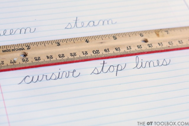
The ruler can then be used to guide or self-check letter height.
Looking for more ways to make cursive handwriting consistent and legible? Try these ideas:
New Feature...DOWNLOAD THIS POST AS A PDF! CLICK HERE


