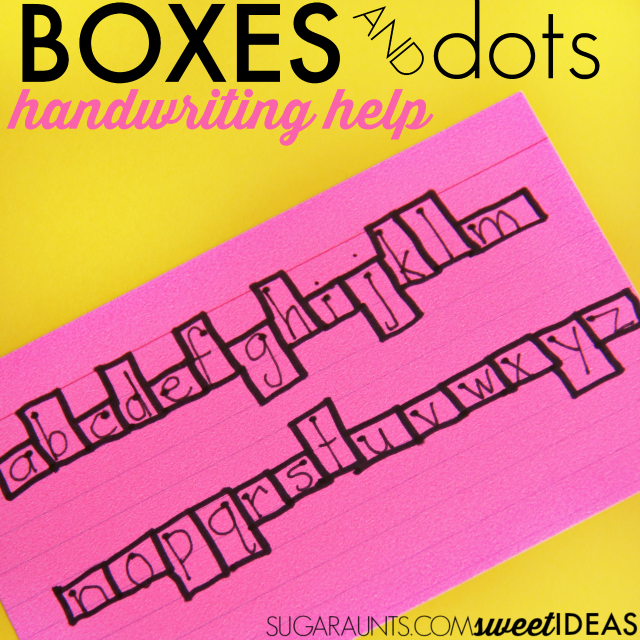
This handwriting technique is a strategy that I’ve used many, many times in school-based Occupational Therapy. It’s a handwriting strategy that uses boundaries of boxes and starting dots to help kids become more aware of letter size, letter formation, spatial organization, and use of lines.
The box and dot handwriting strategy is perfect for kiddos who are working on placing letters appropriately on the lines with awareness of tall letters (b, d, f, h, k, l, t) that should touch the top line, small letters that should reach half-way between the top and base stimuli lines (a, c, e, i, m, n, o, r, s, u, v, w, x, z), and tail letters that should drop down below the base line (g, j, p, q, y).
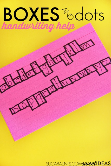
Box and Dot Handwriting Strategy for Better Letter Formation and Spatial Organization
The dots in the boxes allow kids to practice letter formation by starting at the start point using the visual cue of a starting dot. This is perfect for kids who are working on improving letter formation in a single stroke (r, m, n, etc) or letters that require the writer to pick up their pencil for portions of the letter formation (a, d, etc). Sometimes, kids form the letters in “parts” as they build the letter instead of forming it accurately for speed and legibility. The starting dot can help with pencil placement to address this part of letter formation.
The sized boxes of this handwriting strategy are great for allowing kids to form letters with appropriate spacing, giving kids a definite visual cue for spatial awareness between letters and words.
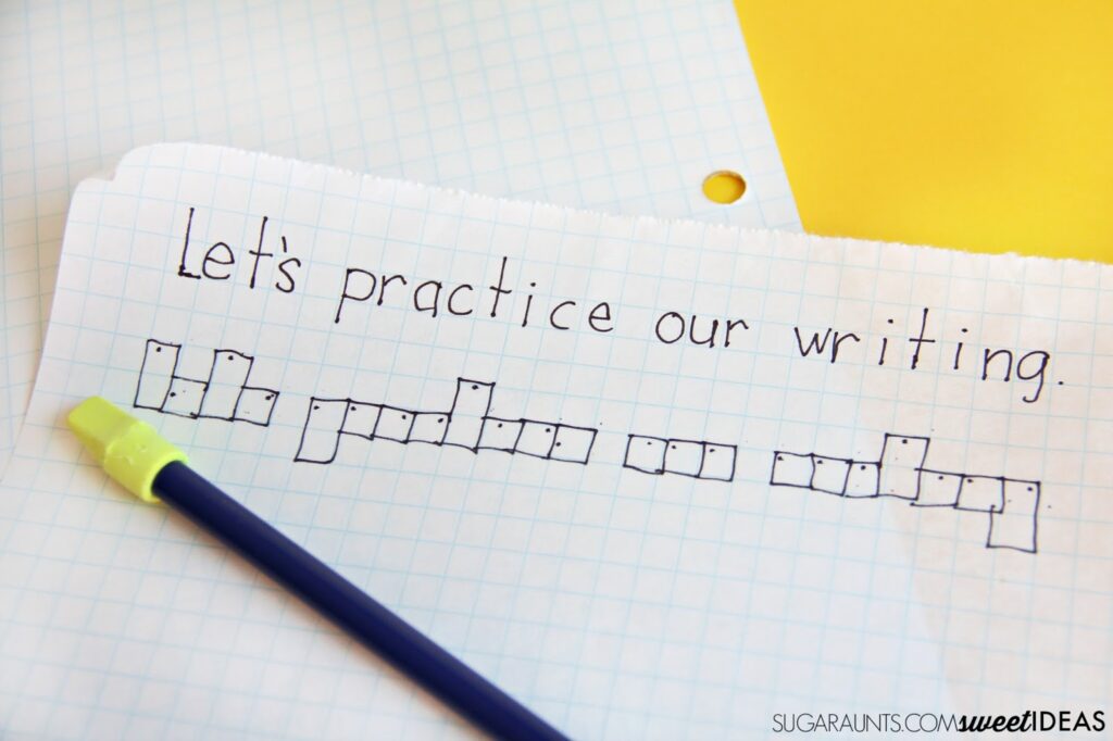
This handwriting technique can be used as an accommodation that allows students to learn letter size, placement, and formation. This accommodation can be used on regular paper, graph paper, or worksheets. When students start to demonstrate better understanding on letter characteristics, the boxes and/or dots can be faded out and eventually removed.
One strategy for grading down this tool is to first remove the dots from the boxes. Other students may benefit from removing the boxes before the dots. Simply adding a dot to writing spaces can provide the visual prompt needed for letter formation and placement.
Another technique for lessening the amount of visual cue is to transition students to a highlighter space for the bottom space or bottom half of lined paper.
Other times, using the boxes and dots on the words that are being copied are all that are needed for carryover of line awareness, letter formation, and spatial awareness.
Love this handwriting trick? Stop over to see all of the simple handwriting tricks for better handwriting in our 30 handwriting series. This post is part of our Easy Quick Fixes to Better Handwriting series. Be sure to check out all of the easy handwriting tips in this month’s series and stop back often to see them all.